The highlights at a glance
- The navigation has been improved to save space and to see the structure at a glance without sub-navigations.
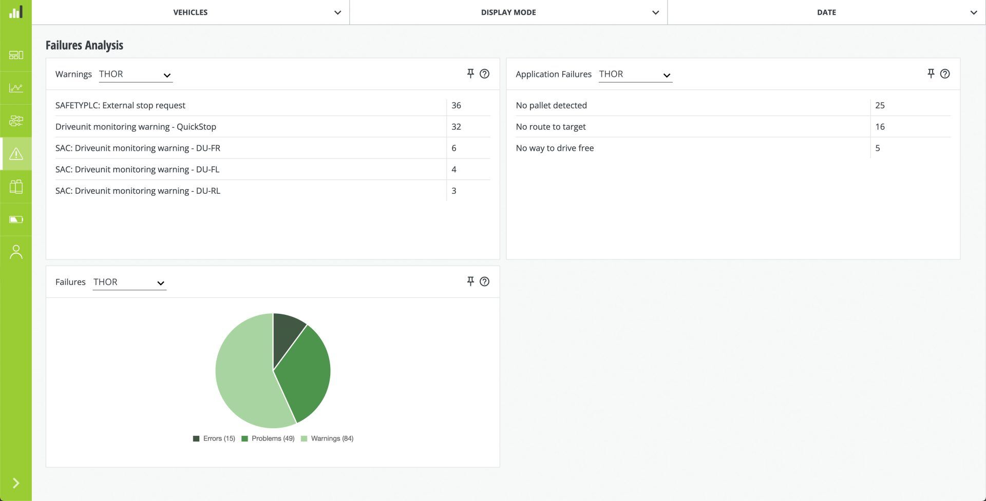
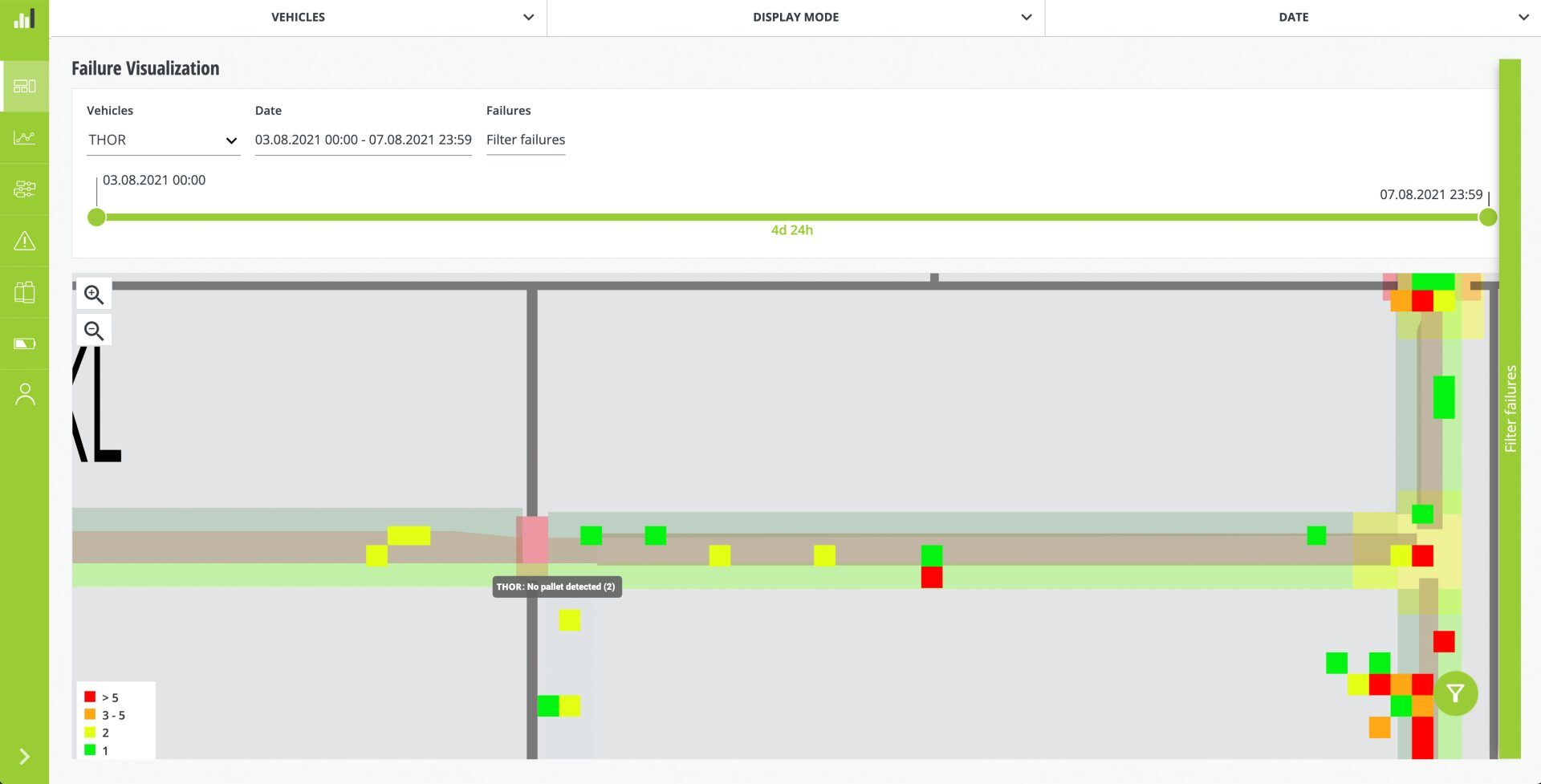
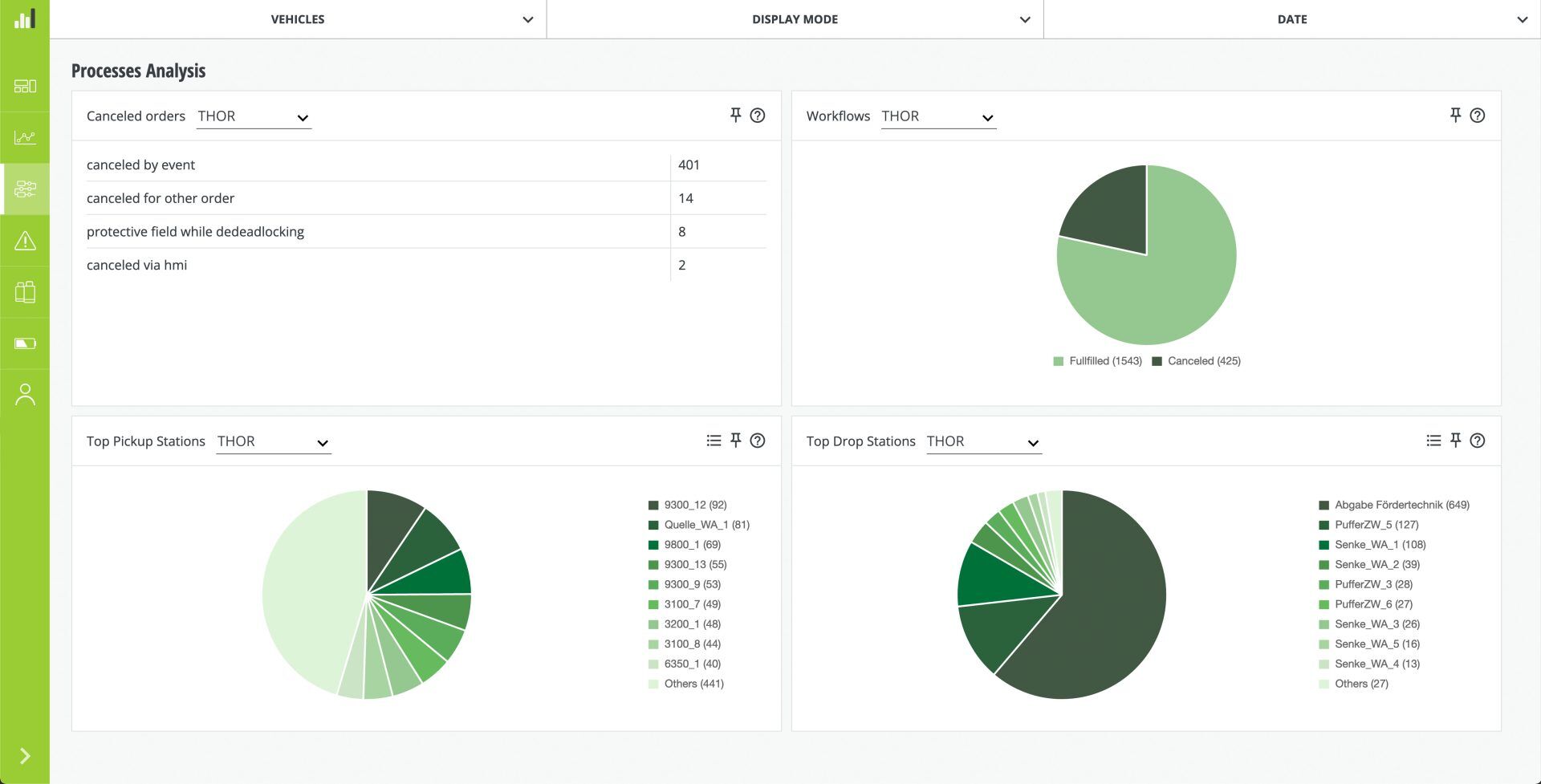
- There are many new charts as well as filter and analysis options for failures and processes.
- You are now able to export tables showing failures, workflows and actions.
- You can easily export your dashboard as a PDF with just one click.
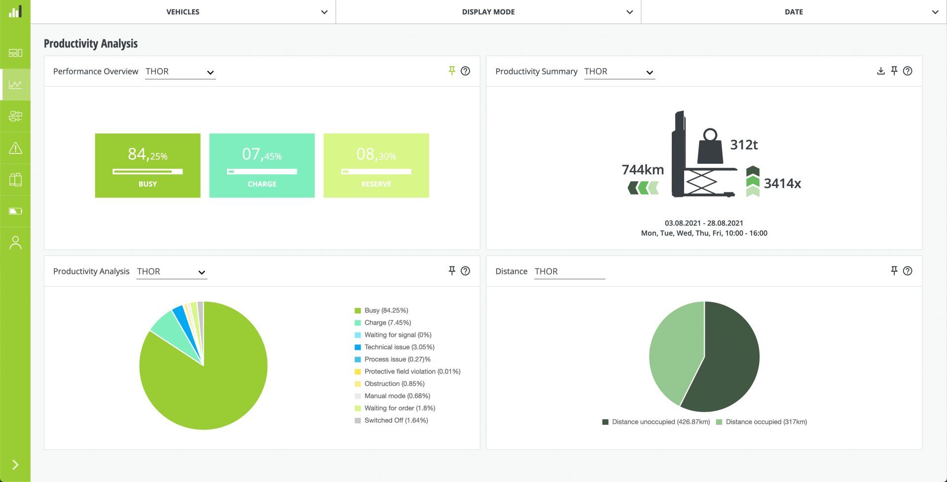
Productivity
- The charts have been divided into analysis and history.
- A chart showing the relationship between occupied and unoccupied transport distance has been added.
- For the sake of clarity, ten donut charts have been combined into one pie chart. This allows for targeted analysis using just one chart – without losing any information.